Eugene Fedorenko is Writing, Reading, and Traveling

Reading (never enough)

Current books: The Making of a Manager: What to Do When Everyone Looks to You by  Julie Zhuo The Elements of Style by William Strunk Jr. Europe: A History by Norman Davies

See posts only about books, articles, or websites.

Hamburger menus and hidden navigation hurt UX metrics

By Kara Pernice, Raluca Budiu

While researching options for a mobile-friendly navigation in a new app I am working on, this article became very helpful with its results from a quantitative usability testing that Nielsen Normal Group conducted.

Golden words on “mobile-first” approach:

Obviously, there’s a general principle here: if a design technique is intended to span platforms X and Y, then an uncompromising X-first approach will make Y an afterthought and harm users on Y. As explained in our course on Scaling User Interfaces, to design for X and Y, you need to consider the strengths and needs of both and adapt the two versions of the website accordingly.

Two main (and expected) findings on a hidden navigation:

  1. It is significantly less discoverable.
  2. It decreases user experience both on mobile and on a desktop.

Their recommendations at the end of the article for both desktop and mobile navigations make a lot of sense and tested with time. See also their checklist of 15 guidelines on menu design.

Facebook's Product Design Director on maintaining a productive work environment

By Geoff Teehan, Amandah Wood

An interview with Geoff Teehan from Teehan+Lax fame, currently a Product Design Director at Facebook. I've been a fan of his work for a while, and in this interview he talks about his current role at Facebook, design leadership, how Teehan+Lax got started and eventually closed, his daily routines, and much more.

Bringing together personas, jobs to be done, and customer journey maps

By Shahrzad Samadzadeh

Not really an article, but an interesting chart explaining how personas, jobs to be done, and customer journey maps get used together at Cooper. I was interested in combining JTBD and personas for quite some time and this is definitely a realistic approach.

Are you writing legacy CSS code?

By Jim Newbery

One of the most sane articles I ever read on code refactoring, writing maintainable CSS, and visual regression testing.

On a definition of “legacy code”:

In his 2004 book, Working Effectively With Legacy Code, Michael Feathers describes a different definition of ‘legacy code’. He defines it as code that is not covered by tests. That’s it. If you think about it for a moment, it makes sense. It applies to old or new code. It focuses on maintainability and understandability. Code without tests is hard to change with confidence.

On visual regression testing:

Visual regression testing tells you that something has changed. The tests themselves do not describe how we expect the system to behave. When a test fails, we still have to interpret the visual diffs to identify both what the expected layout is, and how our implementation differs from it. It’s really a more consistent, sensitive and faster version of manual cross-browser testing.

The right to read

By Richard Stallman

A short anti-utopian fictional story on a future where DRM ebooks become a norm.

Later on, Dan would learn there was a time when anyone could go to the library and read journal articles, and even books, without having to pay. There were independent scholars who read thousands of pages without government library grants. But in the 1990s, both commercial and nonprofit journal publishers had begun charging fees for access. By 2047, libraries offering free public access to scholarly literature were a dim memory.

Personally, I am a big fan of DRM-free ebooks by O'Reilly. If a book is not available through them I'd rather buy a paper copy.

Camera-phone Lucida

By Jacob Mikanowski

A fascinating look at a place that Instagram takes in our lives and how it recycles art of the past.

On selfies:

The first selfie in recorded history was made by Leon Battista Alberti in Florence, sometime around the year 1435. Alberti sculpted his self-portrait in wax and then had it cast in bronze. It’s a portrait medallion, and an unusually large one. It looks like a very large, awkwardly shaped, oval coin. Connoisseurs tell us that it is obviously the work of an amateur. There’s a blemish on the cheek from a casting flaw, and the ear, though ably sculpted, rises too far above the rest of the relief, creating the odd impression of a whorled mountain towering over the plain of Alberti’s face. But then amateurishness is part of the medallion’s message. Coins and medals were the province of emperors and kings. And now here is Alberti, the illegitimate son of a merchant father, born in exile and without a lasting position anywhere, saying to the world: This is my face. Take a good look—it’s worth your time.

On photos of food:

The golden era for the depiction of food in art came with the popularization of the still life in seventeenth-century Holland. The first society to experience the problem of having too much money and too much stuff, the Dutch had multiple genres of food-related still lifes, each dealing in a different level of luxury. [ … ] Instagram’s obsession with food isn’t the only thing it shares with the Golden Age of Dutch art. In seventeenth-century Holland, art was plentiful and cheap. A middle-class home might contain a hundred or more paintings, and a canvas could be purchased for far less than the price of a tablecloth or a fine plate. It was the first time in history that ordinary people had easy access to images that depicted their surroundings and did so without prejudice. The result was a world of images that was at once vast and trained on the ordinary. It was an art that collapsed hierarchies of class and subject matter—an art that could concern itself, deeply, with breakfast.


Metrics versus experience

By Julie Zhuo

A very good look at why measuring stuff matters:

You can’t really argue that you made something better if nothing ever changes with how people use your product. Conversely, if you make a change and people start to use your product less, I don’t care what you did, but the evidence is fairly clear that you messed something up.

It's hard to disagree with Julie on this, even while I had a fair share of cases where wrong parameters were measured or with wrong tools. She provides a few good examples of wrong things to measure and instances where metrics fail us. Two of my favorites:

Understanding the cost of complexity: each time you add a new feature to your app, it’s likely that the metrics you are tracking will turn up positive (after all, before nobody used X, and now more people use X, and people don’t seem to be using Y or Z any less, so overall this feels like a win.) However, if you keep adding features, at some point, you’ll end up with what’s perceived as a cluttered and bloated product. Then, suddenly, some shiny new competitor will gain fast traction because everybody’s like “I love Q! It’s just so simple.”
The power of big bets: no metric can tell you what the bold strokes needed to win the future are. Imagine 2008, when smartphones were just starting to emerge. If you looked at the metrics for your website, you would have seen a tiny sliver of traffic coming from smartphones. You may have concluded, very practically, that you shouldn’t really invest too much into building for mobile since it’s such a small part of your audience. Today, we realize the vision and foresight of those who did bet big on mobile and reaped huge rewards. No examination of current behavior can accurately tell which way you need to leap. Strategic, long-term planning still requires much of the same thing it always did: trusting your gut.
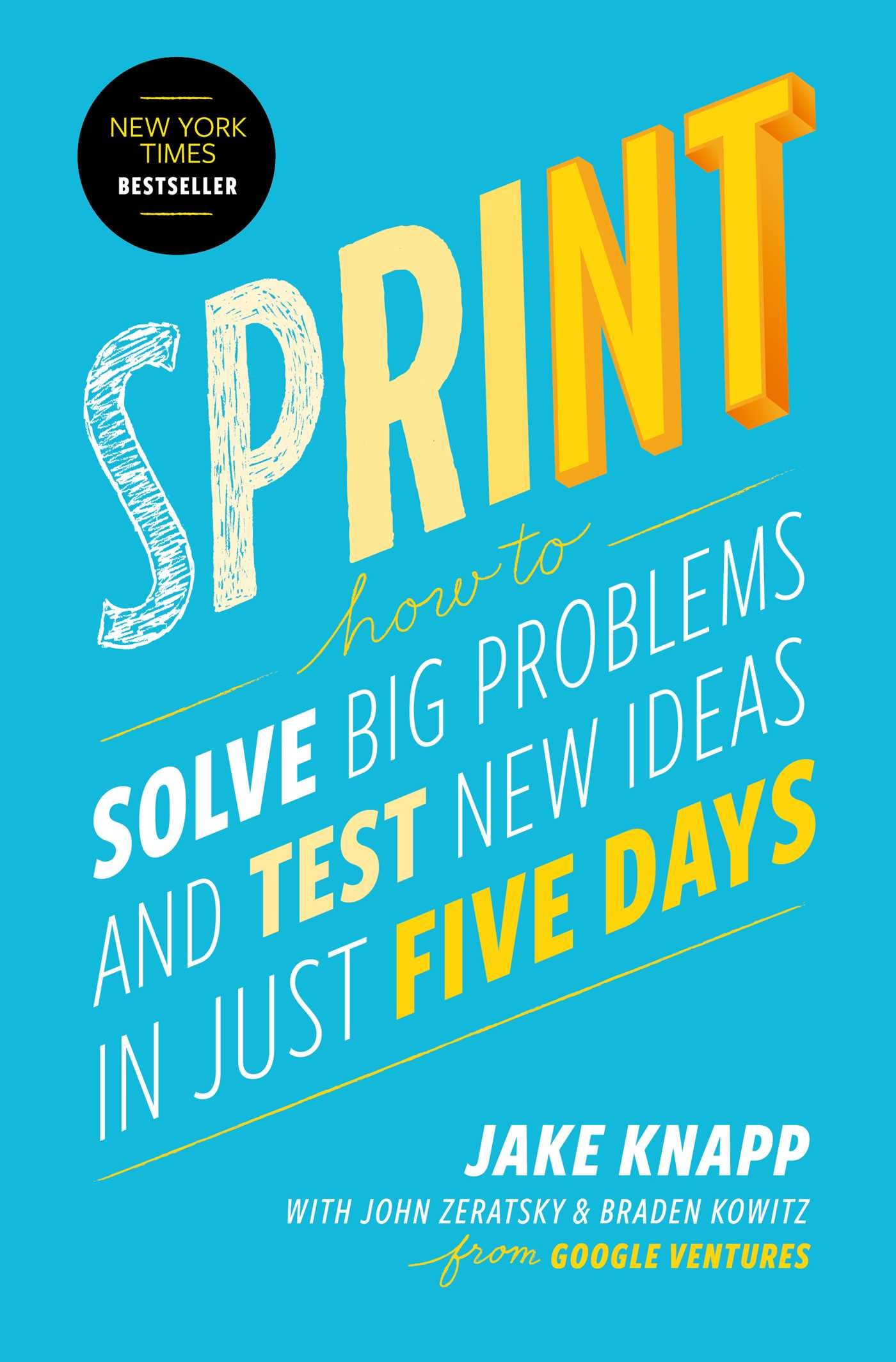
Sprint

Sprint

By Jake Knapp

The design sprint is a five-day process invented at Google for solving tough problems and testing new ideas. It was run on a range of products from Google Search and Gmail to companies funded by Google Ventures like Blue Bottle Coffee and Slack.

Keep reading…

Human-centered design considered harmful

By Don Norman

I am in the middle of Cooper's book "About Face" now, which basically established Goal-Oriented Design, so this take on Activity-Centered Design versus Human-Centered Design was pretty interesting.

On user research:

Most items in the world have been designed without the benefit of user studies and the methods of Human-Centered Design. Yet they do quite well. Moreover, these include some of the most successful objects of our modern, technological worlds.

On activities vs tasks:

Do note the emphasis on the word “activity” as opposed to “task.” There is a subtle difference. I use the terms in a hierarchical fashion. At the highest levels are activities, which are comprised of tasks, which themselves are comprised of actions, and actions are made up of operations. [...] For example, mobile phones that combine appointment books, diaries and calendars, note-taking facilities, text messaging, and cameras -- can do a good job of supporting communication activities. This one single device integrates several tasks: looking up numbers, dialing, talking, note taking, checking one’s diary or calendar, and exchanging photographs, text messages, and emails. One activity, many tasks.

On difference between HCD and ACD:

Activity-Centered Design (ACD) is actually very much like Human-Centered Design (HCD). Many of the best attributes of HCD carry over. But there are several differences, first and foremost being that of attitude. Attitude? Yes, the mindset of the designer.
The activities, after all, are human activities, so they reflect the possible range of actions, of conditions under which people are able to function, and the constraints of real people. A deep understanding of people is still a part of ACD. But ACD is more: it also requires a deep understanding of the technology, of the tools, and of the reasons for the activities.

On listening to users too much:

One basic philosophy of HCD is to listen to users, to take their complaints and critiques seriously. Yes, listening to customers is always wise, but acceding to their requests can lead to overly complex designs. Several major software companies, proud of their human-centered philosophy, suffer from this problem. Their software gets more complex and less understandable with each revision. Activity-Centered philosophy tends to guard against this error because the focus is upon the Activity, not the Human. As a result, there is a cohesive, well-articulated design model. If a user suggestion fails to fit within this design model, it should be discarded. Alas, all too many companies, proud of listening to their users, would put it in.

Evaluating employees in product design & development roles

By Mike Davidson

An unexpected take on a controversy of evaluating employees in product design and development roles from Mike Davidson, a former Head of Design at Twitter.

On decision quality:

There is a phenomenon in tech called easy-to-measuritis which says that we tend to concentrate on the things we can easily measure rather than the things that are most important. [...] We want objective, binary ways of evaluating people so that they are uncontroversial and unassailable, but what we end up with are objective, binary ways to measure the wrong things, or at the very least, things that employees are not in direct control of. Instead, we should be measuring decision quality instead of outcome quality. After all, how we behave is always 100% within our control.

On four pillars used at Twitter Design:

[...] reward behavior over outcomes, emphasize the importance of teamwork and execution, and keep everything within each employee’s control.